One panel, a clear menu and an easy path to booking
KGBeauty is Krystyna Gawor's podiatry and beauty clinic in Kraków. We built a site where clients can compare treatments and go straight to booking, while the clinic manages its entire menu from one panel.
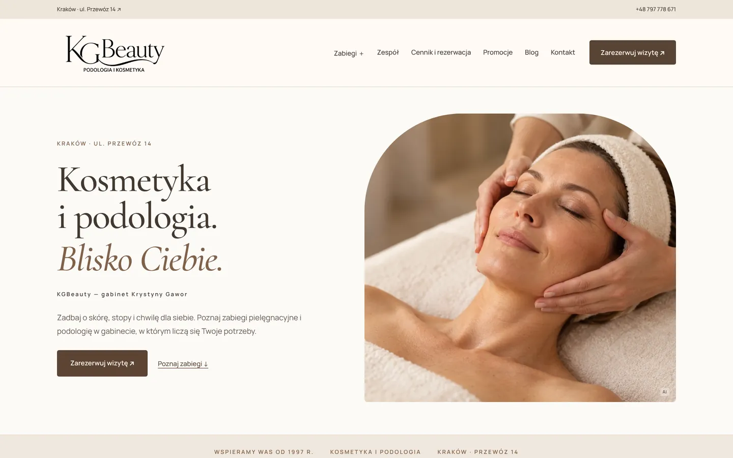
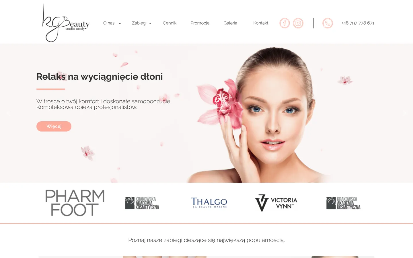
- Client
- KGBeauty, the clinic of Krystyna Gawor
- Industry
- Podiatry and beauty treatments
- Their customers
- Kraków locals looking for podiatry care, facials, body treatments, manicures and pedicures
- Services
- Website design & build, copywriting, service catalog, Saloner booking integration, local SEO & GEO, speed optimization, owner's manual
- Timeline
- October – November 2026
- Platform
- WordPress, Elementor, a custom catalog module, Saloner
- Live site
- kgbeauty.pl ↗
A big menu that needed a simpler way to book
People come to KGBeauty for podiatry care as well as treatments for the face, body, hands and feet. A returning client who knows the treatment name wants its price and availability fast. A first-time visitor first needs to understand how the services differ and who performs them. The site had to serve both without making anyone dig through the whole menu.
Behind the scenes, the problem was just as concrete. Changing one price, name or description meant editing several pages by hand, because a treatment appeared in its category, in the price list and on its own page. The clinic needed to add and retire services without calling an administrator every time.
Two more requirements: bookings run through Saloner, a Polish booking system, so the site had to send clients to the right treatment variant or to a phone call. And after a hosting move, old links from Google still had to land somewhere useful on the new site.
What we set out to do
- Make treatments easy to find by name, category or the specialist who performs them.
- Lead from description and price to booking the right variant, or to a phone call.
- Let the clinic add, update and retire services in one WordPress panel.
- Show the location and the team's experience, and tidy up indexing, redirects and search-engine data.
From one catalog to every booking
We started with one question: what does a client need to know before booking? Sometimes it's just the price; sometimes it's what the treatment involves or who performs it. Every one of those paths now leads to the same catalog, wherever it starts.
- 01
Separate browsing from quick comparison
Categories help people who know which area they need. Each treatment page explains the scope and shows its variants. The price list gathers everything in one place with search and filters, so a client can start from a description or a name and move on when ready.
- 02
One source of truth in WordPress
A custom offer panel holds names, prices, descriptions, durations, categories and the specialists assigned to each service. Shared templates display that data across the site. The owner can draft, publish, trash or restore a service, and changing a price never means rebuilding a page.
- 03
Connect the team to the actual menu
On the team page, clients meet Krystyna Gawor and the other specialists, then jump to the price list filtered by that person. The filter uses the assignments set in the offer panel.
- 04
Buttons that mean one thing
The general
Book a visit
button opens the price list so clients pick a service first. The button next to a specific variant goes straight to its Saloner booking or starts a phone call. - 05
Content and an owner's manual
We edited the treatment copy, team bios and blog articles, and wrote a manual for adding services, changing prices and publishing posts. A brand book records the fonts, colors and components so the site stays consistent.
How the design helps people choose a treatment

Address and booking in the header
The address in the top bar shows right away where visits take place, which matters to someone comparing clinics on a phone. The booking button stays in the header, so it's always one tap away while reading about treatments or the team.
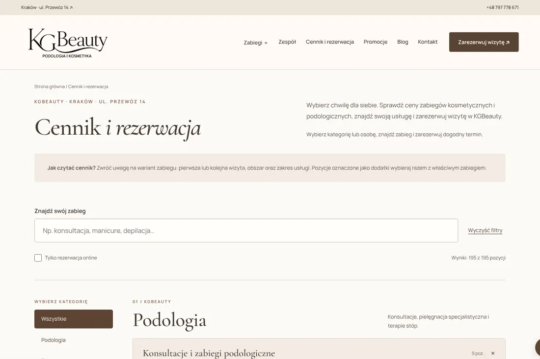
Price and variants in one predictable layout
Every service card uses the same layout, so a client moving between treatments finds the description, variants and booking in the same places. On the price list, search and filters skip the categories that don't matter right now.
The team is part of the booking path
Bios explain what each specialist does and their experience. After reading a profile, a client can open that person's services directly. It answers two common questions at once: who performs the treatment, and how do I book it?

Calm typography and recognizable buttons
Cormorant Garamond gives headings a clear hierarchy and Manrope keeps menus and labels easy to read. Light backgrounds separate sections, a brown button marks the main action and a dark footer closes the page, so the booking link is easy to spot everywhere.
What keeps the site fast and visible
The WordPress layer combines shared Elementor templates with the custom offer module. Images use WebP in sizes matched to the screen, WOFF2 fonts are served from the clinic's own domain, and the first screen shows content without waiting for an entrance animation. The price list reserves space for its search controls to prevent layout shifts, and the service template includes a skip link for keyboard users.
After the move, we checked redirects from old addresses, the XML sitemap and metadata. Structured data connects the clinic with its services and team. Google Site Kit links Search Console and Analytics, and the Complianz banner passes consent choices through the WP Consent API.
| Metric | Result |
|---|---|
| Price list, mobile performance | 99 |
| Homepage, mobile performance | 91 |
| Both pages, desktop performance | 100 |
| Price list, mobile Largest Contentful Paint | 1.4 s |
| Homepage, mobile Largest Contentful Paint | 3.5 s |
Source: Google PageSpeed Insights (Lighthouse 13.6 lab data), November 18, 2026.
The price list scored 99 out of 100 on mobile
In Google PageSpeed Insights tests on November 18, 2026, the homepage scored 91/100 on mobile and the price list 99/100. On desktop, both pages scored 100/100. These are Lighthouse lab results; real-user data for these addresses isn't available yet.
A post-migration check on November 17, 2026 counted 97 services in the panel and 195 items in the public price list, including variants. Each treatment is edited once in the offer panel and updates everywhere it appears. For clients, search and filters narrow the list, the treatment page explains what's involved, and every path ends with a link to the right booking variant or a phone number. We don't report bookings, revenue or ranking changes here, because they fall outside the measured period.

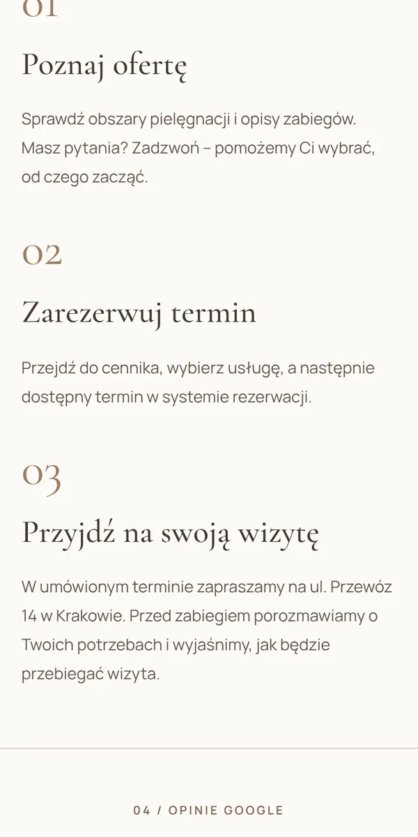

On the phone: screens from the live site, captured November 2026.
A catalog designed for everyday work
The biggest lesson from this project is about life after launch. The more services and variants a clinic has, the more it matters where the current menu lives. For the owner, one shared catalog is the starting point for every change; for clients, it's a predictable path from treatment name to price, description and booking.
Let's build a simpler path to your bookings
Big service menu and prices to update in several places? In a free teardown, we'll show you where clients lose their way to booking and what's worth simplifying.
B2B beauty wholesale · Kraków · 2022–2026
A lean budget, a custom B2B store and 5.74x ROAS
Read the case study

Beauty education & supplies · Kraków · 2024–2026
An outdated site turned into a measurable training funnel
Read the case study

Youth sports & camps · Kraków · 2024